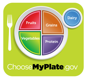
The “Food Pyramid” was an early post back in February.
 In a campaign backed by the First Lady Michelle Obama, this has now been replaced (by the USDA — the American Department of Agriculture) by “My Plate”.
The new icon sets out on “your plate” –a guide to a healthy, balanced way of eating.
In principle anyway, it is simpler and more logical than the pyramid image–we eat off plates not pyramids–though I don’t find it visually pleasing.
Will its message get through?…
We have just finished lunch
and without intending to–it was stuff I found in the refrigerator– I ended up pretty much following the guidelines.
It was a Salad of:- (protein, grain, vegetable, and dairy)
chickpeas (pg)–out of a tin or, as in my case, dried, soaked overnight, then simmered in water until tender
with thinly sliced/chopped fennel (v)
some chunks of avocado (v)
a small cucumber, de-seeded and chopped (v)
thinly-sliced red onion (v)
small pieces of cooked chicken breast (p)
a few black olives (v)
some cubes of goats cheese with (dp)
chopped parsley (v)
with an olive oil and lemon juice dressing–oh and a few dry roasted (in a frying pan) pumpkin seeds(pv) scattered over, seasoned with salt and pepper.
And–we ate it off plates!
“Eat food. Not too much. Mainly plants.”
(Michael Pollen–in Food Rules, an Eater’s Manual)


Oh dear, my plate looks nothing like that – it’s mostly blue! Lots of yummy French cheese, you see 🙂
I’ll make an effort.
I found your blog through Keith Eckstein by the way. Nice interview 🙂
Thanks Gigi–a side salad to go with the cheese?!
I think that in order for “My Plate” to get its message across it should look like food not plastic. The colors are gaudy; it could also have some bits of food for each food type, in agreeable colors. That’s my thought.
Penny